

Welcome to The Market’s Compass Emerging Market’s Country ETF Study, Week #585. As always, it highlights the technical changes of the 20 EM Country ETFs that I track on a weekly basis and publish every third week. Paid subscribers will receive this week’s unabridged Emerging Market’s Country ETF Study sent to their registered e-mail. Past publications can be accessed by paid subscribers via The Market’s Compass Substack Blog. Next week I will be publishing The Market’s Compass Developed Markets Country ETF Study. On Sunday I published the latest edition of The Market’s Compass Crypto Sweet Sixteen Study which I publish on a weekly basis and tracks the technical changes of sixteen of the larger capitalized Cryptocurrencies.
This morning’s Market’s Compass Emerging Markets Country ETF Study is being sent to free subscribers tomorrow (although a day later) as well as my regular paid subscribers today in a not so vailed attempt to lure free subscribers to support the work done in the three ETF Studies and the Weekly Crypto Sweet Sixteen Studies.
To understand the methodology used in constructing the objective EM Country ETF Individual Technical Rankings visit the mc’s technical indicators page at www.themarketscompass.com and select “em country etfs”. What follows is a Cliff Notes version* of the full explanation of the methodology I use…
*The technical ranking system is a quantitative approach that utilizes multiple technical considerations that include but are not limited to trend, momentum, measurements of accumulation/distribution and relative strength of each individual 20 EM Country ETFs that can range between 0 and 50. The Total EM Technical Ranking or “TEMTR” is the sum of the twenty individual TRs and can be viewed as an overbought / oversold indicator as well as a confirmation / non-confirmation indicator. There is also a Total Ranking for each geographic region that can be viewed as a relative measurement on a week over week basis.
This past week The Total EM Technical Ranking or “TEMTR” fell -8.48% to 669.5 from 731.5 the previous week which was up slightly from the 728 reading three weeks ago for the week ending 2/13. The Total Asia-Pacific Ranking fell the most in the three geographic regions, down -13.1% to 269 from 310 the week before. The Total EMEA EM Ranking fell -5.3% to 203.5 from 215. The Total Lat AM EM Ranking fell -4.8% to 196.5 from 206.5 the previous week.
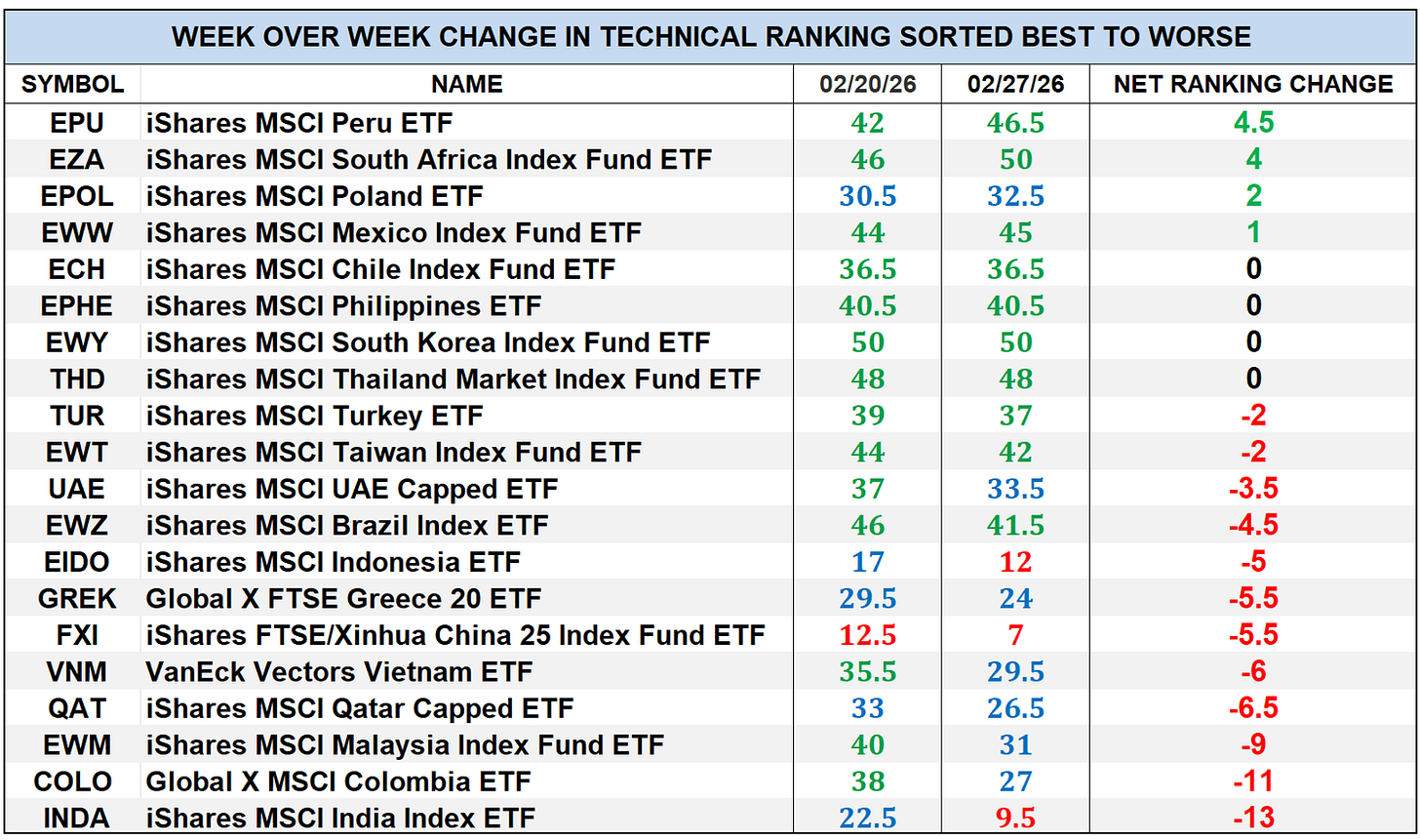
Four of the twenty EM Country ETFs I track in these pages registered a gain in their Technical Rankings or TRs over the past week; four were unchanged and twelve had TRs that fell, of which two fell double digits. The iShares MSCI India Index Fund ETF (INDA) and the Global X MSCI Columbia ETF (COLO) TRs fell -13 and -11 respectively. Last week ten TRs were in the “green zone” (TRs between 34.5 and 50), seven were in the “blue zone” (TRs between 15.5 and 34), and three were in the “red zone” (TRs between 0 and 15). The previous week, fourteen of the EM Country ETF TRs ended the week in the “green zone”, five were in the “blue zone”, and one was in the “red zone” marking a technical deterioration in EM. The average TR loss was -3.11 vs an average TR gain the previous week of +0.18.
*To understand the construction the of The Technical Condition Factors visit the Market’s Compass website www.themarketscompass.com and go to the mc’s technical indicators page and select “em country etfs”.
A short version of the how the Technical Condition Factors are calculated follows…
There are eight Technical Condition Factors (“TCFs”) that are a summation of the twenty ETFs TRs technical condition of each TCF question. The eight Technical Condition Factors do not ask the same number of questions. That is why it is calculated as a percentage. If a TCF individual reading is 100% that would mean that all Twenty ETFs fullfilled that particular TCF criterior.
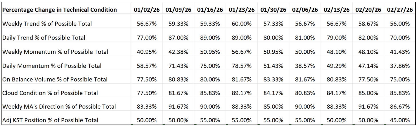
This past week a reading of 37.86% was registered in the Daily Momentum Technical Condition Factor (”DMTCF”) or 53 out of a possible total of 140 positive points.
As a confirmation tool, if all eight TCFs improve on a week-over-week basis, more of the 20 ETFs are improving internally on a technical basis, confirming a broader market move higher (think of an advance/decline calculation). Conversely if all eight TCFs fall on a week-over-week basis it confirms a broader market move lower. Last week, only one TCF rose, and seven fell.
The Relative Rotation Graph, commonly referred to as RRGs were developed in 2004-2005 by Julius de Kempenaer. These charts are a unique visualization tool for relative strength analysis. Chartists can use RRGs to analyze the relative strength trends of several securities against a common benchmark, (in this case the EEM) and against each other over any given time period (in the case below, daily) over the past three weeks. The power of RRG is its ability to plot relative performance on one graph and show true rotation. All RRGs charts use four quadrants to define the four phases of a relative trend. The Optuma RRG charts uses, From Leading (in green) to Weakening (in yellow) to Lagging (in pink) to Improving (in blue) and back to Leading (in green). True rotations can be seen as securities move from one quadrant to the other over time. This is only a brief explanation of how to interpret RRG charts. To learn more, see the post scripts and links at the end of this Blog.
Not all 20 ETFs are plotted in this RRG Chart. I have done this for clarity purposes. Those which I believe are of higher technical interest remain.
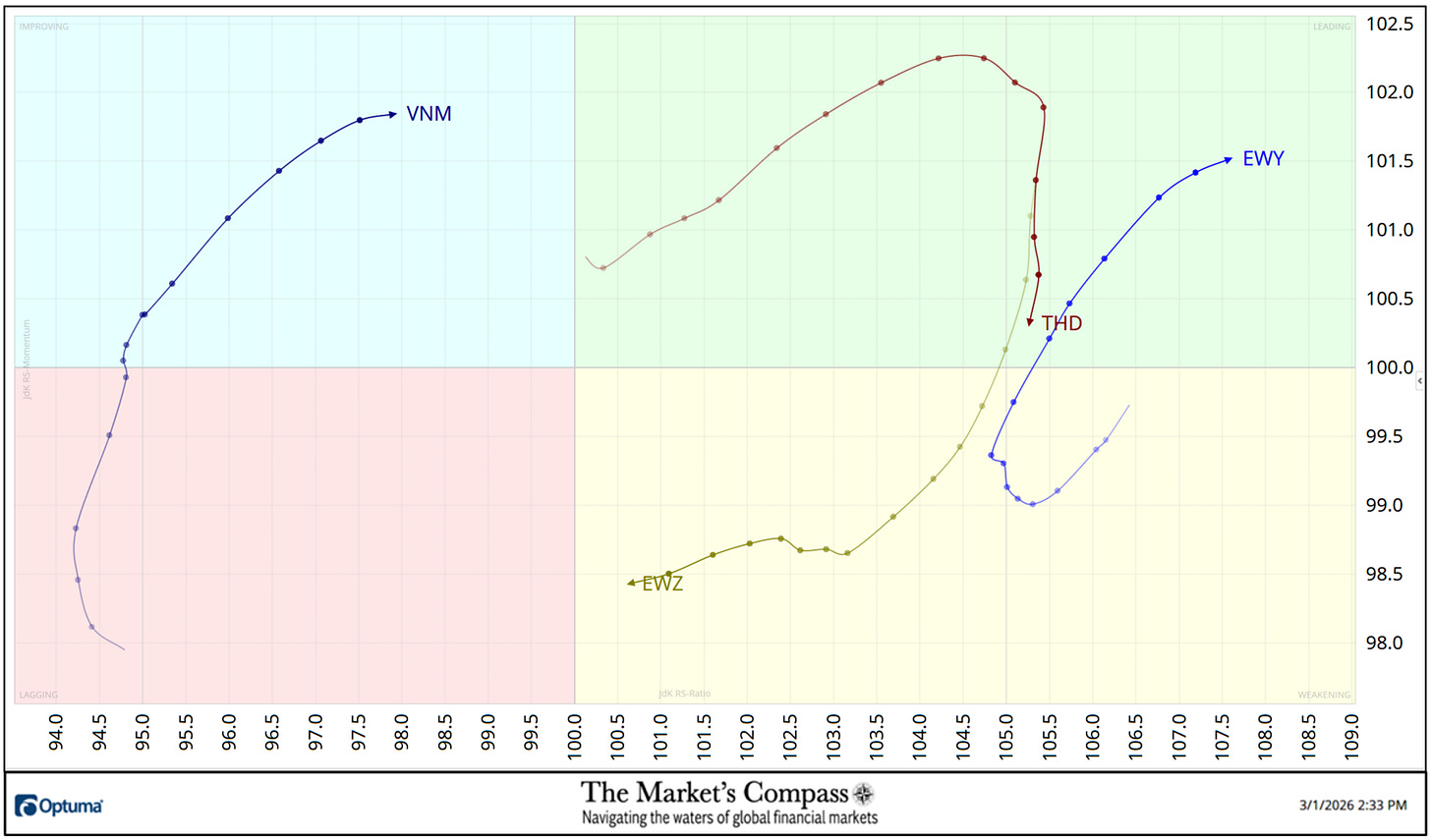
Three weeks ago the iShares MSCI South Korea Index Fund ETF (EWY) began to hook higher in the Weakening Quadrant and the following week to started to gather a pace and entered the Leading Quadrant with improving upside Relative Strength Momentum and at the end of last week the EWY registered the best Relative Ratio vs. the EEM at 107.59 (see the Tabulation Table below). The iShares MSCI Thailand Market Index Fund ETF (THD) rolled over in the Leading Quadrant two weeks ago and has been losing Relative Strength Momentum since and is one or two days from slipping into the Weakening Quadrant. The iShares MSCI Brazil Index Fund ETF (EWZ) fell into the weakening Quadrant three weeks ago and has continued to track lower losing Relative Strength. The VanEck Vectors Vietnam ETF (VNM) has been gaining Relative Strength Momentum for three weeks and entered the Improving Quadrant leaving the Lagging Quadrant behind.
The “Tabulation Table” below marks the Relative Strength and Relative Strength Momentum readings vs. the iShares MSCI Emerging Markets Index ETF or EEM. It begins with the readings at the end of last week followed by the trailing three weeks that includes the readings from the last Study for the week ending 1/16. If there has been an improvement in either the Relative Strength Ratio or the Relative Strength Momentum reading on a week-over-week basis I have highlighted it in green. If there has been a contraction in either, it is highlighted in red and an unchanged reading in either will remain black. The color-coding system serves as a heat map over the past four Friday’s readings highlighting either the continued improvement, deterioration, or stasis vs. the benchmark, the EEM. The ETFs that are displayed on the RRG chart above are highlighted in blue.
*The “TEMTR” is the sum of the 20 Individual Objective EM ETF Technical Rankings. It serves as an overbought or oversold as well as a confirmation / non-confirmation indicator.
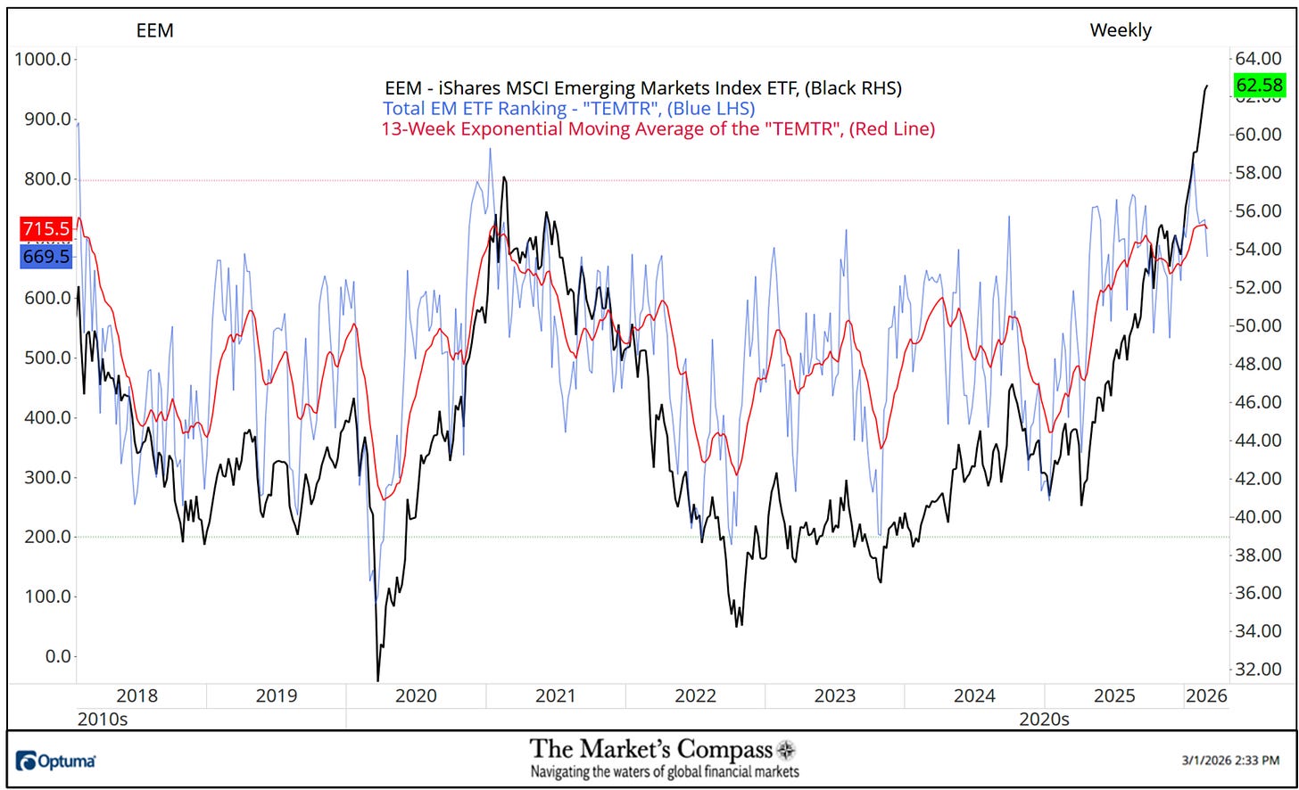
The sub-title of this week’s Study is “IMO Somethings Gotta Give. The technical reason for that secondary title can be seen on the chart above. The Total Em ETF Ranking or TEMTR fell below the 13-Week Exponential Moving average (red line) to a sub-700 reading last week while EEM rose to a new Weekly closing high. The Moving average has begun to roll over. This is notable divergence as prices rallied to new highs. As will be seen on the shorter-term Weekly and Daily chart there are more technical features that suggest that the EEM is stretched and due for a larger pullback in price.
*The “ATR” like the “TEMTR” serves as an overbought or oversold as well as a confirmation / non-confirmation indicator.
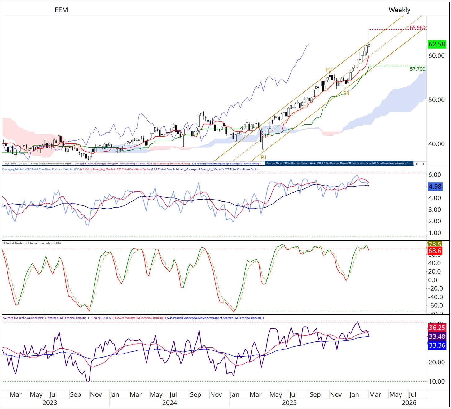
As will be seen on the Daily chart that follows these comments on the Weekly chart, on Friday the EEM initially spiked higher overtaking the Upper Parallel (solid gold line) of the Schiff Modified Pitchfork (gold P1-P3) on the Weekly chart above but by the end of the day it returned to the confines of the Pitchfork. The Emerging Markets Total Condition Factor Oscillator has fallen over the past five weeks in a divergence from the recent intra-week highs at 65.90. The 8-Week Stochastic Momentum Index (center panel) has begun to roll over from a overbought extreme and the Average EM Technical Ranking has also rolled over and is teetering on Moving Average support.
Learn about Pitchforks and their applacation in the three-part Pitchfork tutorial in the Market’s Compass website, www.themarketscompass.com
More on the technical condition of the EEM in Thoughts on the Short-Term Technical Condition of the EEM but first…
*Does not include dividends if any.
Seven of the twenty EM Country ETFs were up on an absolute basis last week and thirteen traded lower over the week. Seven of the EM ETFs outperformed the +0.38% gain in the EEM on a relative basis and thirteen underperformed. The average five-day absolute gain in the EM ETFs was 0.00% vs. a 0.38% gain in the EEM. The previous week the average absolute gain was +2.00%.
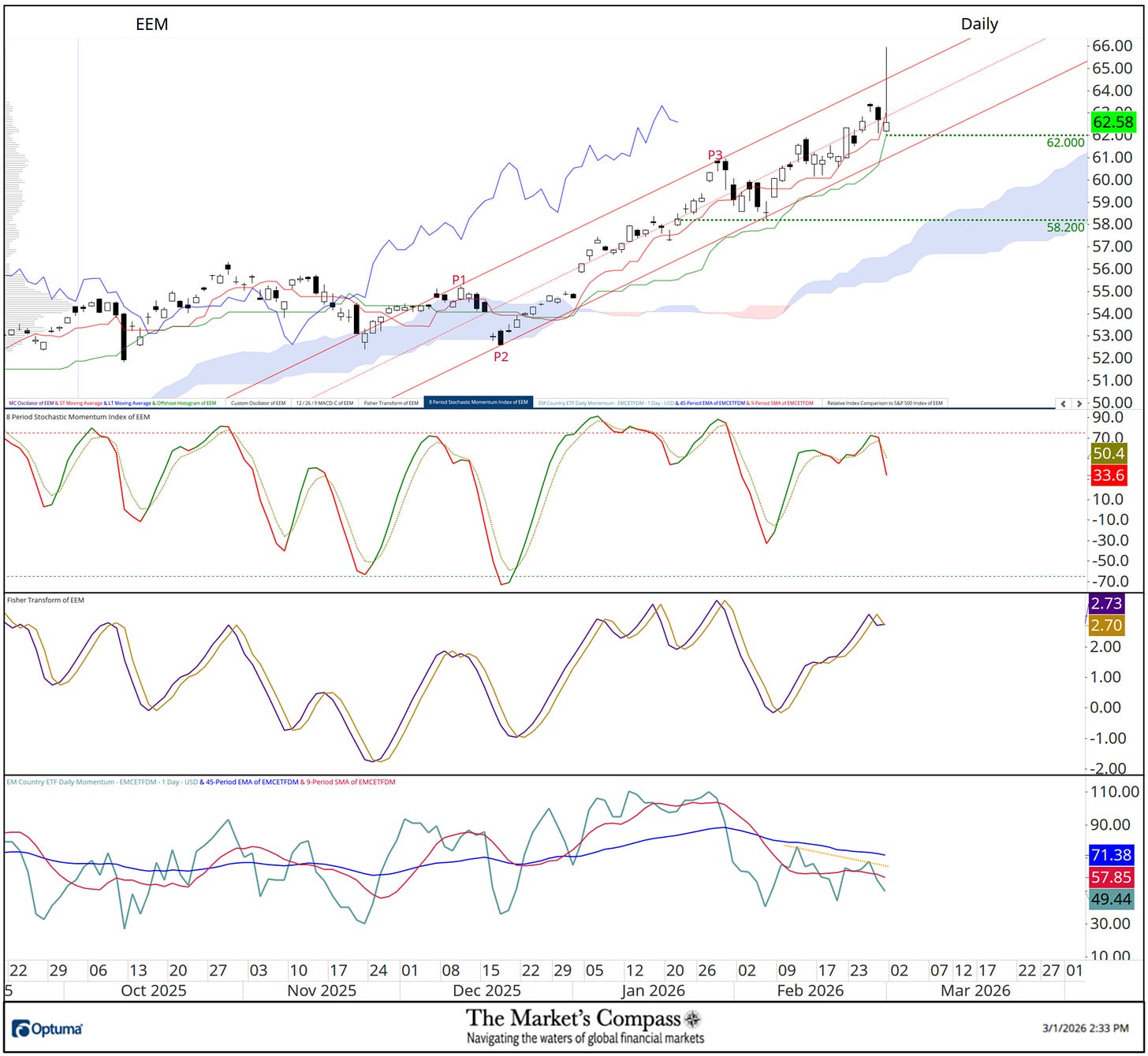
The Daily chart above reveals aforementioned Friday’s intra-day spike higher through the Upper Parallel (solid red line) of the shorter-term Schiff Modified Pitchfork (red P1-P3) and the subsequent reversal that followed with a break below the Median Line. The Stochastic Momentum Index has rolled over from overbought territory through its signal line. The most concerning short-term technical feature is displayed in the lower panel. The EM Country ETF Daily Momentum / Breadth Oscillator has turned lower again at a lower high (yellow dotted line) and has fallen below both moving averages in a non-confirmation of last week’s new price highs. All of these technical points suggest that a correction of a larger degree is in the cards.
All the charts are courtesy of Optuma whose charting software enables anyone to visualize any data including my Objective Technical Rankings. The following links are an introduction and an in-depth tutorial on RRG Charts…
https://www.optuma.com/videos/introduction-to-rrg/
https://www.optuma.com/videos/optuma-webinar-2-rrgs/
To receive a 30-day trial of Optuma charting software go to…
www.optuma.com/TMC.